Introduction
In my last post, I shared why I finally started a blog as a developer. Over the years, I’ve dealt with my fair share of frustrating platforms — clunky interfaces, slow load times, and “features"" that seemed designed to annoy. Those experiences shaped what I wanted for my own blog, so I’ve set a few key principles to guide this project:
- Freedom: I wanted full control over the content, design, and functionality, without being locked into someone else’s platform or rules.
- Developer Experience (DX): Writing and publishing should feel effortless.
- Simplicity: The blog should be clean and easy to navigate, without unnecessary clutter.
- Performance: Fast loading times and smooth interactions are a must.
- Privacy-first: No invasive tracking of personal information — just a straightforward, respectful experience for readers.
Ultimately, I chose to build the site myself instead of relying on a platform. Each decision about the tech stack was intentional, focused on creating something that works well and feels good to use. Let’s dive into how it all came together!
By the way, if you’d like to explore the source code, it’s available on GitHub: thiagozf.com.
Inspirations
When it comes to philosophy, I drew a lot of inspiration from Bear — a privacy-first, no-nonsense, super-fast blogging platform. I seriously considered using it, but having full control over my content and design was dealbreaker.
For UI, Glance perfectly captured the exact aesthetic I had in mind. I also took inspiration from other sites like Supreme website, which nails a bold, minimalist design without unnecessary frills
Tech Stack
To build this blog, I handpicked tools that align with my focus on simplicity, performance, and developer experience:
- Astro: A static site generator perfect for markdown-based content. It’s lightweight, fast, and keeps things straightforward.
- Tailwind CSS A utility-first CSS framework that makes styling ergonomic and efficient, without the overhead of traditional CSS.
- Bun A blazing-fast runtime and package manager that streamlines development and speeds up the build process.
- Cloudflare Pages A hassle-free hosting solution that’s easy to set up and delivers excellent performance.
Each tool was chosen to reflect the blog’s principles: no bloat, no unnecessary complexity. Next, we’ll take a closer look at each tool and explore why it made the cut, how it fits into the overall architecture, and what made it stand out. Let’s start with Astro!
Astro: Content-First by Default
Astro stood out as the perfect static site generator for this project. Being content focused, it revolves around native Markdown support. Writing posts is as simple as creating a Markdown file with some frontmatter for metadata. Astro handles the rest, transforming it into a fully optimized and styled static page.
That is another key feature of Astro: delivering content with minimal overhead, which is exactly what I wanted.
Astro achieves this by shipping zero JavaScript by default. Unlike traditional frameworks that bundle JavaScript for every page, Astro only includes JavaScript when explicitly needed, using a technique called “islands architecture.” This means the blog is fast and lightweight, even on slower connections.
Finally, Astro comes with built-in optimizations like automatic image compression, HTML minification, and lazy loading. These features ensure that the blog not only looks good but also performs exceptionally well.
Tailwind CSS: Styling Without the Bloat
Styling a blog can quickly become a headache if you’re not careful. Traditional CSS frameworks often come with a lot of bloat, and writing custom CSS can be time-consuming. That’s where Tailwind CSS comes in.
Tailwind takes a utility-first approach, meaning you style elements by applying small, reusable classes directly in your HTML. This eliminates the need for custom CSS files and keeps your styles tightly coupled with your markup.
One of Tailwind’s best features is its purge capability. In production builds, Tailwind automatically removes any unused CSS classes, resulting in a tiny stylesheet. This is crucial for keeping the blog lightweight and fast.
Bun: Fast All-in-One JS Toolkit
I wanted to iterate on my blog fast. That’s where Bun came in, a runtime and toolkit designed to replace Node.js and npm.
Bun’s standout feature is its speed. Dependency installation is significantly faster compared to other package managers, and builds complete in a fraction of the time. This is a game-changer for a blog that’s frequently updated, rebuilt, and redeployed.
But Bun isn’t just about speed — it’s also about convenience. It combines a package manager, bundler, and runtime. It also has built-in TypeScript support.
tl;dr: Bun simplifies the entire workflow and offers a seamless developer experience.
Cloudflare Pages: Hosting with Ease
Hosting was another critical decision. I wanted a platform that was fast, reliable and secure. Cloudflare Pages checked all the boxes.
Cloudflare Pages offers global CDN hosting, meaning content is served from the nearest edge location to the reader. This ensures fast load times no matter where your audience is located.
Deploying the blog is also a breeze. Every time I push changes to GitHub, Cloudflare Pages automatically rebuilds and deploys the site. It’s a seamless process that lets me focus on writing rather than managing infrastructure.
The Starting Point: astro-erudite
Once the tech stack was set on stone, the next step was finding a solid reference to build upon. While I wanted to create something unique, I also didn’t want to start completely from scratch. That’s when I found astro-erudite, a minimalist Astro blog template. Spoiler: it was a godsend!
astro-erudite is a beautifully crafted template by enscribe (jktrn on GitHub). Here are some of its features:
- Clean and simple design: The layout is distraction-free, readable, and elegant—exactly what I wanted for a content-focused blog.
- Tailwind CSS: The utility-first approach keeps styling minimal and maintainable. It also includes Tailwind Typography, which ensures content is automatically formatted for readability.
- Syntax highlighting: It uses Shiki, a lightweight and visually appealing solution for code snippets — a must-have for any developer blog.
- No fluff: Every feature feels intentional, with no unnecessary bloat or over-engineering.
The template also came with a strong set of built-in features, including:
- A clean, content-first layout.
- An RSS feed for readers who prefer to follow along that way.
- SEO optimizations, like Open Graph tags, to make sharing posts seamless.
- Semantic HTML for better accessibility and structure.
It was the perfect foundation: simple, elegant, and purpose-driven. All it needed was a few personal tweaks to make it truly mine.
The Changes
While astro-erudite was a great starting point, I made a few changes.
Switch to Bun
The template originally used npm as the package manager. I replaced it with Bun for faster installs and builds. It made the development process smoother and more efficient.
That was an easy one: I just needed to remove the package-lock.json file
and run bun install to generate a new lock file. For good measure,
I’ve also set Bun as the package manager:
{
"name": "thiagozf",
"type": "module",
"version": "1.2.4",
"private": true,
"packageManager": "[email protected]",
"engines": {
"bun": ">1.1.20",
},
"scripts": {}
}Remove shadcn
The original template uses some shadcn UI elements, like Avatar and Button. Since these components are very simple, I’ve decided to rewrite them as Astro components, reducing the dependencies of the project (hasta la vista, React).
For reference, here is the equivalent Avatar component using Astro.
---
import { cn } from '@/lib/utils'
import { Image } from 'astro:assets'
import logo from '../../public/static/logo.png'
type Props = {
src?: ImageMetadata
width: number
height: number
alt?: string
class?: string
}
const { src = logo, alt = 'Avatar', class: className, ...props } = Astro.props
---
<div
class={cn(
'relative flex h-10 w-10 shrink-0 overflow-hidden rounded-full',
className,
)}
>
<Image {...props} class="aspect-square h-full w-full" src={src} alt={alt} />
</div>However, I preserved the semantic convention involving CSS colors, such as
background and foreground into the Tailwind configuration, since it makes
styling a breeze.
If you didn’t know yet, shadcn/ui convention helps you to transform styles
like "bg-stone-50 text-stone-900 dark:bg-stone-900 dark:text-stone-50"
into "bg-background text-foreground", which is both more semantic and easier
to modify. If I want to change my blog’s theme, I don’t need to change
every component — instead, I just edit a single CSS variable.
Other utility colors such as primary, secondary, muted,
accent, and destructive also exist and are very self-explanatory.
I also kept the cn() utility function, which combines clsx
and tailwind-merge, two packages
which allow painless conditional class overrides, addition and
concatenation:
import { type ClassValue, clsx } from 'clsx'
import { twMerge } from 'tailwind-merge'
export function cn(...inputs: ClassValue[]) {
return twMerge(clsx(inputs))
}This serves two purposes:
- Safely concatenate whatever custom style classes are passed via the
classprop to a base components. - Improve the DX, automatically handling class merges and making conditional styles easier to implement.
I also customized the Tailwind’s theme to match the clean, minimalist aesthetic I was going for. The result is a blog that’s visually simple, with no distractions.
Add Simple Analytics
While I wanted to avoid invasive tracking, I also need some basic insights to understand visitor behavior. If my audience enjoys reading about AI, for example, I can focus on writing content about it rather than topics that are not relevant for them.
Simple Analytics is a privacy-friendly and simple alternative to Google Analytics. It is free, privacy-focused, GDPR-compliant, and doesn’t use cookies or trackers. It was the perfect fit.
The dashboard shows how many visitors are coming to my blog, where they are coming from and what they are interested at once they’re here.
One big plus is that the installation script is very lightweight — less
than 4kb, compared to 371kb from gtag.js —, so it doesn’t hurt
the performance.
Setup was straightforward: I just needed to add their script to all pages.
---
// A component with Simple Analytics script
---
<script is:inline async src="https://scripts.simpleanalyticscdn.com/latest.js"
></script>
<noscript>
<img
src="https://queue.simpleanalyticscdn.com/noscript.gif"
alt=""
referrerpolicy="no-referrer-when-downgrade"
/>
</noscript>---
import Analytics from '@/components/Analytics.astro'
// ...
---
<!doctype html>
<html lang="en">
<body>
<!-- Append it to the end of body, so it is the last thing loaded -->
<Analytics />
</body>
</html>Integrate an OpenGraph Image Generator
To make shared links more visually appealing, I added an Open Graph image generator. This allows me to statically generate social media-friendly images for each post, using its metadata.
Since I don’t need anything fancy for now, astro-og-canvas
was good enough for the job. It generates OG images with a pre-defined layout,
but provides some level of customization. It was also very straightforward to
setup. I just needed to:
- Create a new
src/pagesfile: the route that generates Open Graph images. - Customize the output: use the
OGImageRoutehelper to customize the generated images and export thegetStaticPathsandGETfunctions for. You can read more about the available options in the astro-og-canvas documentation.
Here is the final code. I’m using the frontmatter metadata to build the image. I’ve also added the same font and colors used by the web pages to keep visual consistency.
import { OGImageRoute } from 'astro-og-canvas'
const pages = import.meta.glob('/src/content/**/*.{md,mdx}', { eager: true })
const newPages = Object.entries(pages).reduce((acc, [path, page]) => {
const newPath = path.replace('/src/content', '')
return { ...acc, [newPath]: page }
}, {})
export const { getStaticPaths, GET } = OGImageRoute({
param: 'route',
pages: newPages,
getImageOptions: (_path, page) => ({
title: page.frontmatter.title || page.frontmatter.name || '',
description: page.frontmatter.description || '',
logo: {
path: './public/static/logo.png',
size: [124, 124],
},
font: {
title: {
families: ['JetBrains Mono', 'monospaced'],
weight: 'Bold',
color: [250, 250, 250],
},
description: {
families: ['JetBrains Mono', 'monospaced'],
color: [211, 198, 170],
},
},
fonts: ['./public/fonts/JetBrainsMono[wght].woff2'],
bgGradient: [[10, 10, 10]],
}),
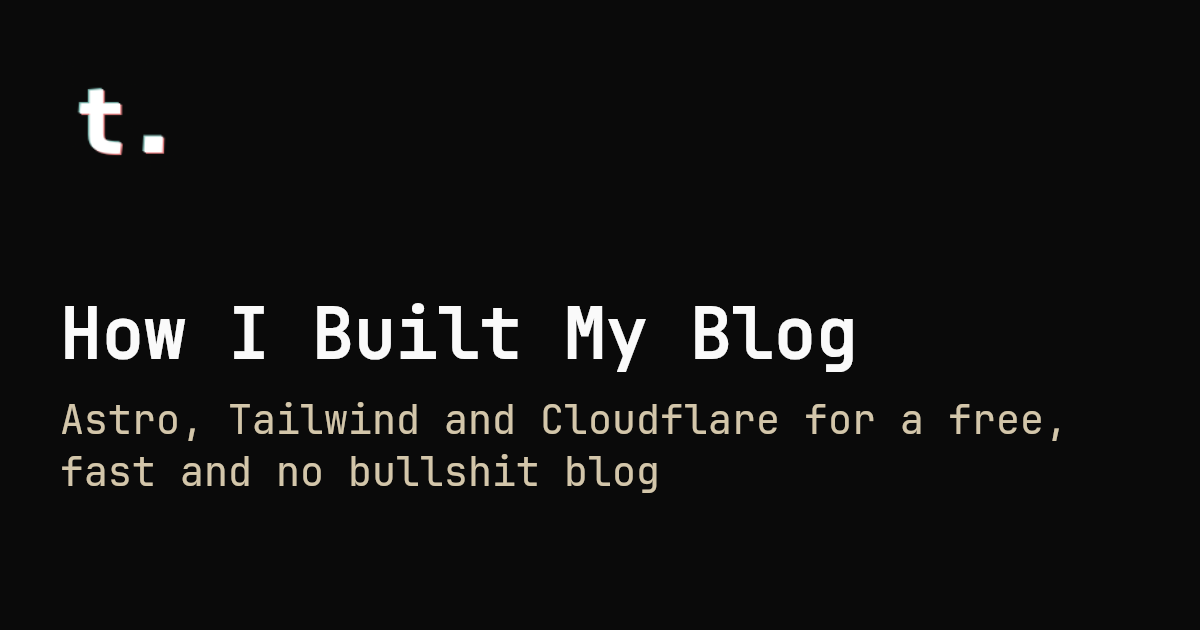
})Every post now has an associated image with it at
/og/blog/${post.id}.png. The image for this blog post,
for example, is /og/blog/how-i-built-my-blog.png:
The cool thing is that it also works for other content collections
of the Astro website, like projects and authors. Here is an
example for the thiagozf’s author profile (/og/authors/thiagozf.png):
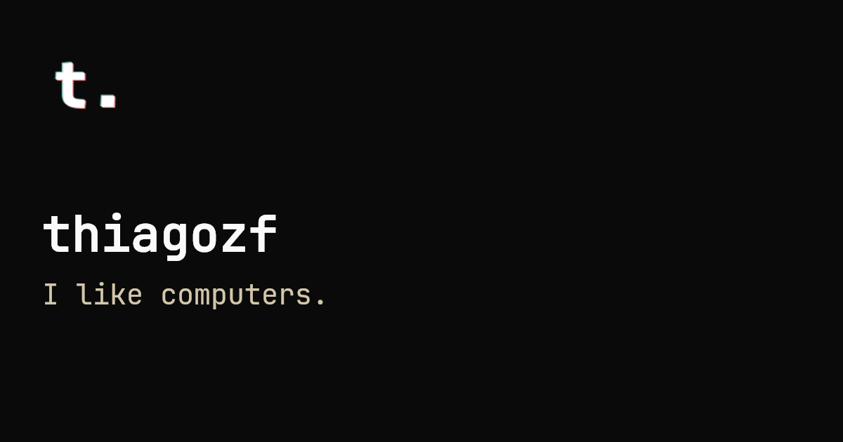
Pretty cool, right?
Add Structured Data for SEO (JSON-LD)
To improve search engine visibility, I’ve added Schema.org JSON-LD structured data to each post. This helps search engines better understand the content and display rich snippets in search results.
It is fairly simple to declare schemas in Astro using the
astro-seo-schema
package: you just need to import the <Schema> component,
that is fully type-safe (it uses TypeScript definitions from
schema-dts).
This <Schema> component:
- Adds type checking to validate user-provided schema JSON
- Escapes the JSON data.
- Outputs a
<script type="type="application/ld+json">with the escaped schema.
Here are the relevant parts of the blog post page (/src/pages/blog/[...id].astro):
---
import { buildPostSchema } from '@/lib/schemas'
import { Schema } from 'astro-seo-schema'
// ...
const schema = buildPostSchema(post, author)
---
<Layout>
<Schema slot="head" item={schema} />
<!-- blog post content -->
</Layout>A utility function buildPostSchema is used to build the schema.
import { site } from '@/site'
import { type CollectionEntry } from 'astro:content'
import type { BlogPosting, Person, WithContext } from 'schema-dts'
import { getPostImage, getPostURL } from './posts'
const buildAuthorSchema = (author: CollectionEntry<'authors'>): Person => {
const { id, data } = author
const { name, email } = data
const url = new URL(`/authors/${id}`, site.url).href
const image = new URL(`/og/authors/${id}`, site.url).href
return {
'@type': 'Person',
name,
url,
email,
image,
}
}
export const buildPostSchema = (
post: CollectionEntry<'blog'>,
author: CollectionEntry<'authors'>,
): WithContext<BlogPosting> => {
const image = getPostImage(post)
const url = getPostURL(post)
return {
'@context': 'https://schema.org',
'@type': 'BlogPosting',
author: buildAuthorSchema(author),
headline: post.data.title,
datePublished: post.data.date.toISOString(),
dateCreated: post.data.date.toISOString(),
description: post.data.description,
keywords: post.data.tags,
image,
url,
}
}Finally, base schemas describing the website and the page were added
on every page (/src/components/Head.astro).
---
import { site } from '@/site'
import { Schema } from 'astro-seo-schema'
const canonicalURL = new URL(Astro.url.pathname, Astro.site).href
const {
title,
description = site.description,
image = new URL(`/og/projects/${site.project}.png`, Astro.site).href,
} = Astro.props
---
<Schema
item={{
'@context': 'https://schema.org',
'@type': 'WebSite',
name: site.title,
description: site.description,
url: site.url,
}}
/>
<Schema
item={{
'@context': 'https://schema.org',
'@type': 'WebPage',
name: title,
description: description,
url: canonicalURL,
image,
}}
/>How It All Fits Together
The DX to add a new post is straightforward:
- Create a Markdown file in the
/src/pages/blogdirectory. - Write the post using markdown and add frontmatter metadata.
- Run
bun run devto preview the post. - Push the changes to GitHub, and Cloudflare Pages handles the rest.
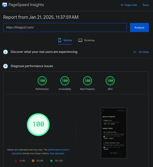
The result is a blog that is blazingly fast, respects reader privacy, and lets the content shine.

Final Thoughts
Building a blog in 2025 doesn’t have to be complicated. By choosing tools that prioritize simplicity, performance, and privacy, I’ve created a platform that’s fast, lightweight, and easy to maintain.
If you’re inspired to start your own blog, I encourage you to explore the tools I’ve used. You don’t need a complex setup to create something meaningful. Sometimes, less really is more!
